Wingman Pro Zero | The Ultimate Survival Watch.
Designing a zero-friction interface for environments where cognitive capacity collapses and physical constraints take over.
Building for reality, not just the canvas.


© 2026 Designed & Documented by Akash Mounabhargav. All Rights Reserved.
Wingman Pro Zero | The Ultimate Survival Watch.
Designing a zero-friction interface for environments where cognitive capacity collapses and physical constraints
take over.
Project Overview
Cognitive performance in extreme environments doesn't degrade gradually. It collapses. Research on survival scenarios shows that physiological stress: cold exposure, exhaustion, injury systematically dismantles the brain's ability to process information, prioritize actions, and execute decisions. Fine motor control goes first. Working memory degrades next. By the time a user genuinely needs a survival tool, their capacity to operate one has already been severely compromised.
My role as PRODUCT DESIGNER
This is the design problem that almost nobody addresses honestly. Most survival interfaces are built for a user in a calm, controlled state. Someone who can read, parse options, and make deliberate choices. That user doesn't exist in the scenarios these tools are built for.
Wingman Pro Zero starts from a different premise entirely: the interface has to make the correct survival decision when the user no longer can. That means stripping away every secondary data set, every menu layer, every moment of required cognitive input that isn't the single most critical action right now. It means engineering for degraded fine motor control. What happens when the user can't accurately tap a small target? What happens when visibility drops? What happens when the primary input mechanism fails?
The result isn't a watch with better UX. It's a triage engine that happens to sit on your wrist, one that operates at maximum clarity precisely when the human wearing it is at minimum capacity.
Building for reality, not just the canvas.
© 2026 Designed & Documented by Akash Mounabhargav. All Rights Reserved.
More Case Studies.
More Case Studies.
WINGMAN PRO ZERO: PROMOTIONAL FILM.
WINGMAN PRO ZERO - CONCEPT FILM.
SET THE STAKES.
In Hong Kong, between September 2021 and August 2022, 30% of all search and rescue operations involved solo hikers. Nearly 10% of them died, not because rescue was impossible, but because it arrived too late.
In Japan, 2023 alone recorded 293 mountain fatalities, 1,400 rescues involving injury, and 1,833 rescues where people survived, but barely.

These aren't edge cases. They're documented, recurring, preventable failures. And the thing most of those people had in common wasn't bad luck. It was no way to navigate, no way to signal for help, and no awareness that the sun was about to set.
This project started with one question: if you stripped away everything a modern smartwatch does and rebuilt it from scratch around the specific problem of staying alive in the wilderness, what would you actually build? Wingman Pro Zero is our answer.
WINGMAN PRO ZERO - CONCEPT FILM.
SET THE STAKES.
In Hong Kong, between September 2021 and August 2022, 30% of all search and rescue operations involved solo hikers. Nearly 10% of them died, not because rescue was impossible, but because it arrived too late.
In Japan, 2023 alone recorded 293 mountain fatalities, 1,400 rescues involving injury, and 1,833 rescues where people survived, but barely.
These aren't edge cases. They're documented, recurring, preventable failures. And the thing most of those people had in common wasn't bad luck. It was no way to navigate, no way to signal for help, and no awareness that the sun was about to set.
This project started with one question: if you stripped away everything a modern smartwatch does and rebuilt it from scratch around the specific problem of staying alive in the wilderness, what would you actually build? Wingman Pro Zero is our answer.

WE DIDN'T DESIGN FOR THE CRISIS. WE DESIGNED FOR THE HOUR BEFORE IT.
Every survival tool on the market is reactive. The SOS button fires after you're lost. The flashlight turns on after it's dark. The compass helps after you've taken the wrong turn. The products available in the market are mostly meant to track daily activity, and there is no product out there that puts its full focus on survival.

We noticed something in the research that shifted how we thought about the entire product: the most dangerous variable in wilderness survival isn't the crisis itself. It's the transition into it - the window where a person still has options, still has energy, still has light, and doesn't know it's closing.
WE DIDN'T DESIGN FOR THE CRISIS. WE DESIGNED FOR THE HOUR BEFORE IT.
Every survival tool on the market is reactive. The SOS button fires after you're lost. The flashlight turns on after it's dark. The compass helps after you've taken the wrong turn. The products available in the market are mostly meant to track daily activity, and there is no product out there that puts its full focus on survival.
We noticed something in the research that shifted how we thought about the entire product: the most dangerous variable in wilderness survival isn't the crisis itself. It's the transition into it - the window where a person still has options, still has energy, still has light, and doesn't know it's closing.
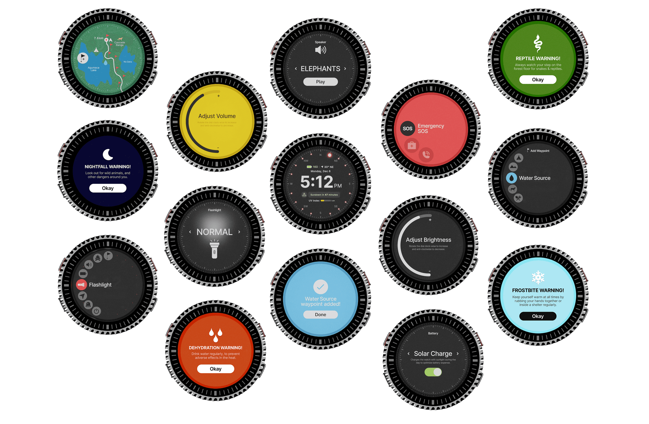
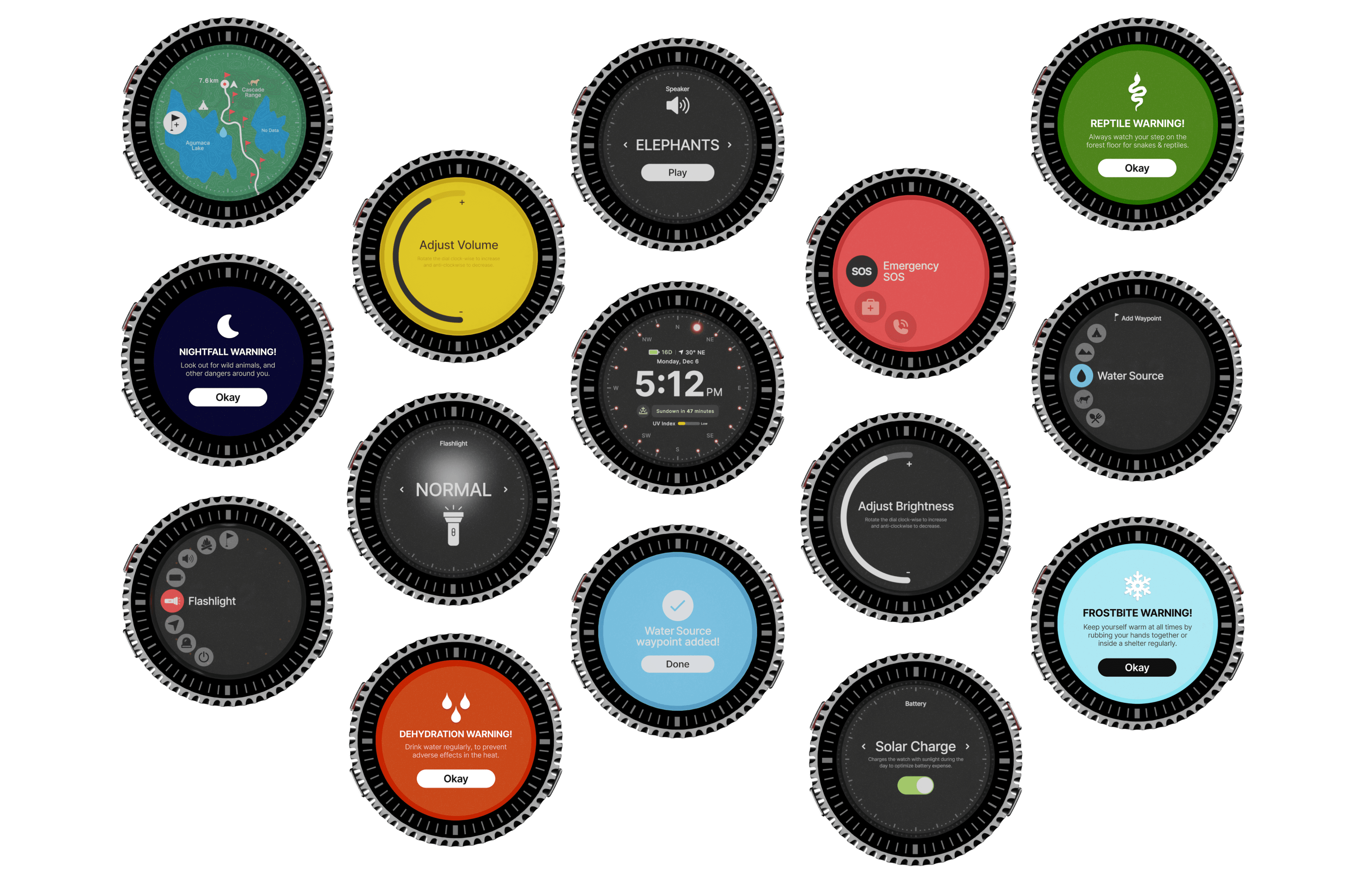
So the most important data point on the Wingman home screen isn't your GPS coordinates. It isn't battery level. It isn't your heading.
It's "Sundown in 47 minutes."
So the most important data point on the Wingman home screen isn't your GPS coordinates. It isn't battery level. It isn't your heading.
It's "Sundown in 47 minutes."
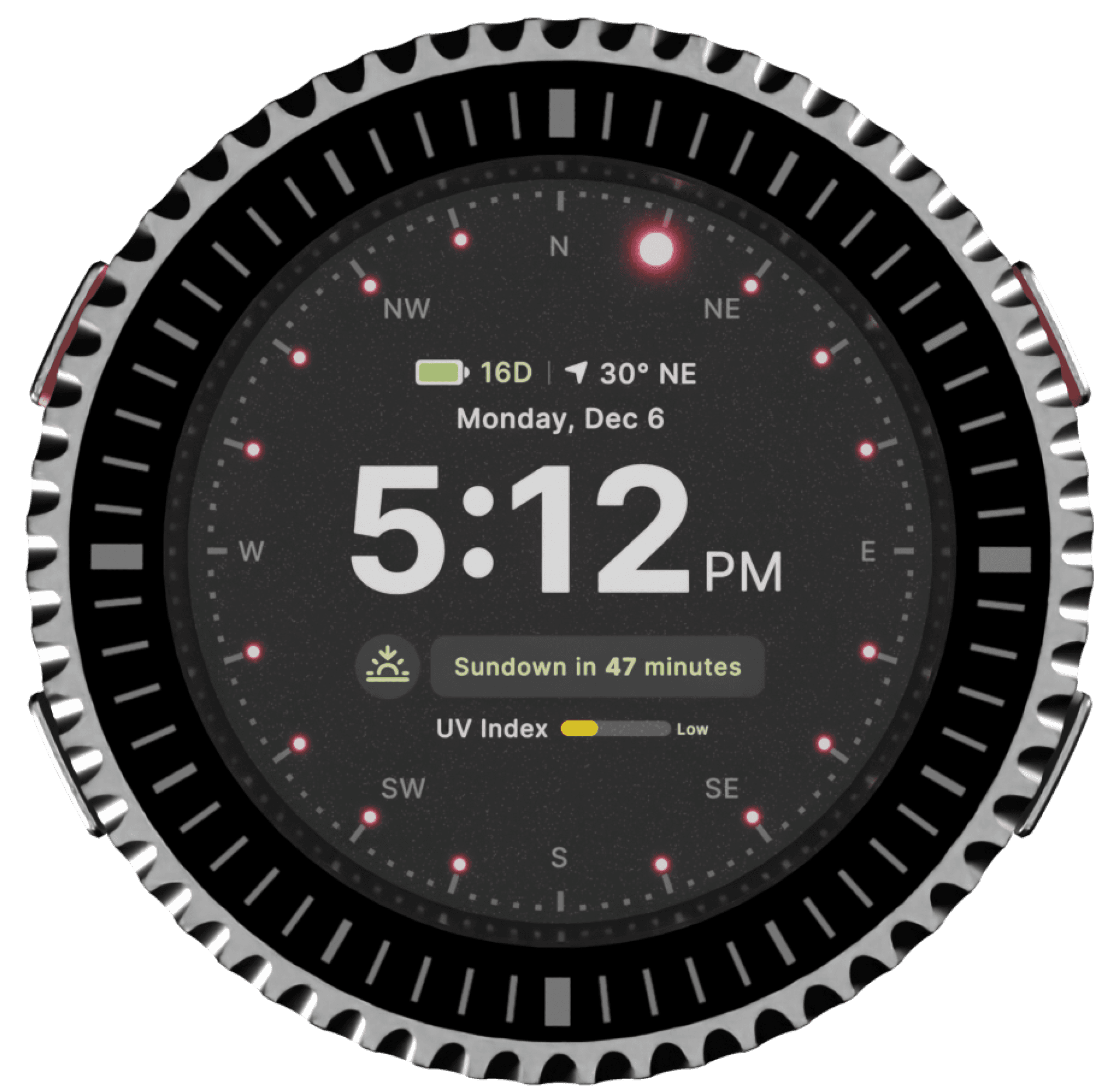
Passive. Always visible. No interaction required. It tells you without asking, exactly how much runway you have before the environment turns against you. That's not a feature. That's a design philosophy: surface the information people need before they know they need it.
Passive. Always visible. No interaction required. It tells you without asking, exactly how much runway you have before the environment turns against you. That's not a feature. That's a design philosophy: surface the information people need before they know they need it.
WE REJECTED THE TOUCHSCREEN.
The default assumption in wearable design is that a touchscreen is the most intuitive input surface. We disagree, specifically for this use case.
In wilderness conditions, a user's hands are wet, dirty, and cold most of the time. Panic degrades fine motor control. Gloves make touch inputs near-impossible. Under any of these conditions, which are exactly the conditions this watch is built for - a touchscreen becomes an obstacle between the user and the action they need to take.
We chose physical buttons instead. Four of them, tactilely distinct, operable without looking, functional with gloves on or hands shaking.
The red button is the SOS. You can find it in the dark without seeing it.
That's not a design preference. It's a survival requirement.
WE REJECTED THE RECTANGLE.
The Apple Watch Ultra is a rectangle. Most smartwatches are rectangles. We tried it. It felt like every other wearable on the market, and more importantly, it failed the core interaction problem.
Circles direct the eye to the center. Naturally, instinctively, without any learned behaviour. In a high-stress scenario where a person is scanning the watch face for critical information in under two seconds, a circular display is not an aesthetic choice, it's an information architecture decision.
WE REJECTED THE TOUCHSCREEN.
The default assumption in wearable design is that a touchscreen is the most intuitive input surface. We disagree, specifically for this use case.
In wilderness conditions, a user's hands are wet, dirty, and cold most of the time. Panic degrades fine motor control. Gloves make touch inputs near-impossible. Under any of these conditions, which are exactly the conditions this watch is built for - a touchscreen becomes an obstacle between the user and the action they need to take.
We chose physical buttons instead. Four of them, tactilely distinct, operable without looking, functional with gloves on or hands shaking.
The red button is the SOS. You can find it in the dark without seeing it.
That's not a design preference. It's a survival requirement.
WE REJECTED THE RECTANGLE.
The Apple Watch Ultra is a rectangle. Most smartwatches are rectangles. We tried it. It felt like every other wearable on the market, and more importantly, it failed the core interaction problem.
Circles direct the eye to the center. Naturally, instinctively, without any learned behaviour. In a high-stress scenario where a person is scanning the watch face for critical information in under two seconds, a circular display is not an aesthetic choice, it's an information architecture decision.

Circles also conform to the human wrist. There are no pressure points, no edges catching on gear or clothing.
Everything about the form factor was chosen because it performs better in the field. Not because it looks different.
Circles also conform to the human wrist. There are no pressure points, no edges catching on gear or clothing.
Everything about the form factor was chosen because it performs better in the field. Not because it looks different.
WE BUILT THE DIAL AROUND THE BODY, NOT THE MENU.
Most wearable OS navigation assumes two things: that the user has a free hand, and that the user is calm enough to read and tap small interface elements. In a survival scenario, neither is reliable.
The rotating dial on Wingman is a direct response to this. Instead of asking the user to navigate a grid or tap through a menu, the dial maps to a circular arc of icons that curves along the left edge of the screen. You rotate to scroll. You press to select. The physical motion is continuous and obvious — the kind of muscle memory a panicking person can still access.

The circular menu arc isn't decoration. It mirrors the bezel's physical geometry, so the relationship between what your hand is doing and what's happening on screen is immediate and legible. No learning curve under pressure.


The dial serves dual purpose outside of navigation too - it controls brightness, volume, and flashlight intensity, without entering any sub-menu. Rotate in one direction, one outcome. That's the level of interaction simplicity that actually works when someone is scared, injured, or exhausted.
WHAT THIS WATCH REFUSES TO BE.
Wingman has no heart rate monitor. No hydration tracker. No step counter. No sleep analysis. No notification integration. No sports performance metrics.
Every one of those features exists in at least one competing wearable. Every one of them was considered and explicitly removed.
The reasoning is simple: each additional feature adds interface complexity, battery consumption, and cognitive load. In a survival scenario, the most dangerous thing a product can do is give a stressed user more to parse. Every feature that isn't directly relevant to the three core survival needs - navigate, communicate, survive, is a feature that could cost someone their life by putting it between them and the one thing they actually need to do.
Wingman is not a wellness device that also does survival. It is a survival device that does nothing else.
That constraint is not a limitation. It's the entire product.
WHAT THIS WATCH REFUSES TO BE.
Wingman has no heart rate monitor. No hydration tracker. No step counter. No sleep analysis. No notification integration. No sports performance metrics.
Every one of those features exists in at least one competing wearable. Every one of them was considered and explicitly removed.
The reasoning is simple: each additional feature adds interface complexity, battery consumption, and cognitive load. In a survival scenario, the most dangerous thing a product can do is give a stressed user more to parse. Every feature that isn't directly relevant to the three core survival needs - navigate, communicate, survive, is a feature that could cost someone their life by putting it between them and the one thing they actually need to do.
Wingman is not a wellness device that also does survival. It is a survival device that does nothing else.
That constraint is not a limitation. It's the entire product.
More Case Studies.
This Project was made in collaboration with
This Project was made in collaboration with

Sudhanva Muralidharan
Sudhanva Muralidharan
3D & Visual Designer, Bangalore.
3D & Visual Designer, Bangalore.

Darkness is the single biggest accelerant of wilderness fatality. Once the sun sets, navigation becomes unreliable, body temperature drops, wild animals become more active, and rescue operations are suspended until morning. A person who is merely lost at 5:00 PM is in a completely different situation than the same person at 8:00 PM.